Why I made this blog
Making a blog
When I was younger, I dreamt of having a blog. But being born too late for MySpace to still be cool, and too young to understand the benefits of documenting my work, that dream slowly faded away as frivolous.
But that’s when ASTRO came in!

- Specifically designed with Markdown and MDX in mind
- BLAZINGLY FAST
- Efficient and lightweight JavaScript usage
- Extensive integration ecosystem
- Island Architecture to use multiple other frameworks (not that I know any other framework)
Had my past prayers been answered 15 years too late..? No matter the answer, it relit my interest in having a blog and documenting my work!
That is how it all started.
So, where are we headed?
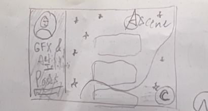
Armed with a few design principles, a pen, some paper, and my questionable Figma skills, I set out to bring this blog to life! The first and final idea I got was having a curve pass through my web page, maybe using shaders. Info bar on the left, posts around the middle, my logo on the top right.
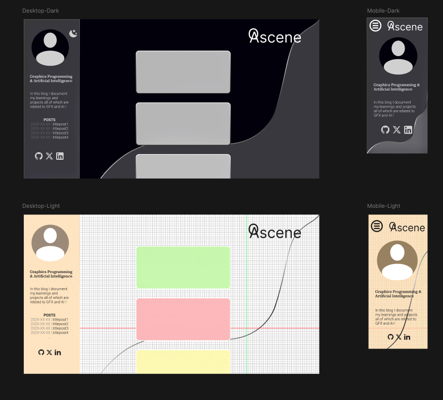
Based on this idea I made a Figma prototype, for the dark and light version:
- The dark version: this smooth black background heavily leaning into glassmorphism with a wave
- The light version: a Cartesian grid with a curve and cardboard sheets leaning into a student aesthetic
HTML, CSS & JS
The holy trinity that makes a blog, a blog
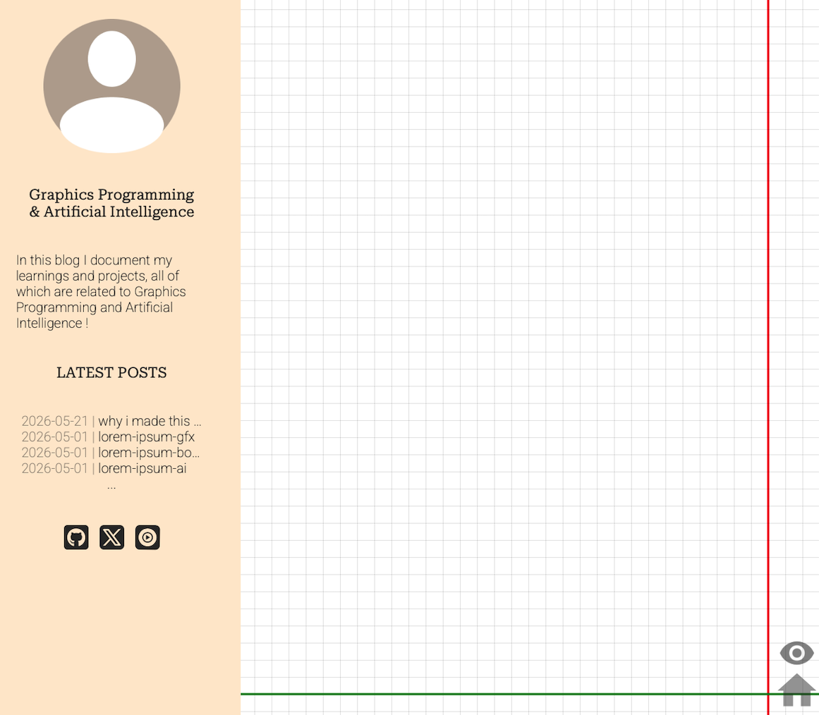
After a little bit of struggling to remember how to actually use CSS and JavaScript, and an easy stroll through the Astro framework’s beautifully crafted tutorials I managed to do these 🌟
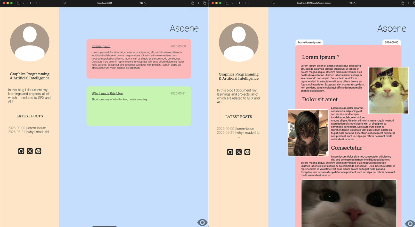
The first blockout of my light version!
I now had to add the grid background, I came up with this little loop which is by no means perfect but did the trick!
//Incredible function that draws a grid on the canvas
function drawGrid(width, height) {
  //size of the tiles and the lines
  let tiles = 25;
  let lineWidth = 1;
  //roughly places the red and green line on the screen
  let redLinePadding = Math.round(displayWidth/300);
  let greenLinePadding = Math.round(displayHeight/200);

  //default color of bg and lines
  ctx.fillStyle = "#fff";
  ctx.fillRect(0, 0, width, height);
  ctx.fillStyle = "rgba(0, 0, 0, 0.1)";

  //vertical lines until above width and incrementing by tile size
  //theres also the red line
  for (let x = 0; x < width; x += tiles) {
    if (x == (width - width%tiles)- redLinePadding*tiles){
      lineWidth = 3;
      ctx.fillStyle= "red";
      ctx.fillRect(x-(lineWidth/2), 0, lineWidth, height);
      ctx.fillStyle = "rgba(0, 0, 0, 0.1)";
      lineWidth = 1;
    }
    ctx.fillRect(x, 0, lineWidth, height);
  }

  //horizontal lines until above height and incrementing by tile size
  //theres also the green line
  for (let y = 0; y < height; y += tiles) {
    if (y == (height - height%tiles)- greenLinePadding*tiles){
      lineWidth = 3;
      ctx.fillStyle= "green";
      ctx.fillRect(0, y-(lineWidth/2), width, lineWidth);
      ctx.fillStyle = "rgba(0, 0, 0, 0.1)";
      lineWidth = 1;
    }
    else{
      ctx.fillRect(0, y, width, lineWidth);
    }
  }
}
But how about mobile ?
So far I had not even considered mobile, I thought about it too deep in the process and remembered harshly why people always say “Mobile first”, the painful process of making it mobile began.
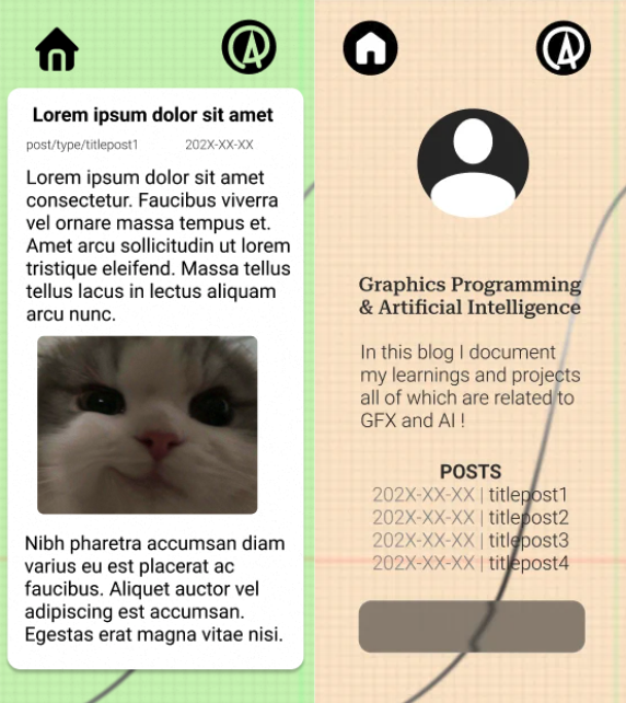
Once again I managed to do a blockout on Figma which I ended up modifying quite a lot.
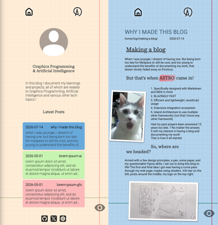 Here was the final version!
And we’re done!
I won’t go into too much detail as to how I’ve made it, as the website has been waiting to be released for too long and it will change a lot in future years!
Thanks for reading, stay tuned!